Tryki999
HL2RP Production Lead & City Administrator
Production
Management
GFX Team
Modeling
Mapping
Prod. Team
City Admin
HELIX-3
Helix Program
Garry's Mod
Welcome! In this suggestion, I aim to outline my ideas for enhancing the server's visuals and provide guidance from my personal experience and expertise on how to achieve this. Here, I will discuss various visual styles, the integration of new models and textures while maintaining existing themes, and the importance of planning and consistency in design choices.
1, Visual Identity of the server
There are many aspects to consider for the server's visual identity. The most prominent is the current "Impulse"-inspired visuals, particularly in the main menu, inventories, and related UI, which remain unchanged and are outdated for a modern server. Therefore, I suggest addressing each part individually and making improvements, from player inventory to the tab menu each aspect should be addressed at least a bit.
This does not require a complete overhaul but rather general enhancements. Gradually phasing out the Impulse identity and developing servers own unique aesthetic will help differentiate server and stray from the impulse theme. The best and easiest way to start this process is by updating the interface.
I believe that character creation and general improvements for the start cinematic of the server are greatly needed, as first impressions for new or returning HL2 players are crucial. This also includes phasing out the word "Impulse" wich is sticked everywhere, perhaps replacing it with something like "Astronet: Half-Life 2 Roleplay," or whatever you decide. Additionally, a custom logo for the server with greater depth in lore or I would say direction to which we wish to take it would be beneficial, and I will return to this point later.
As stated before, more in-depth systems could be implemented regarding clothing and wearable items, incorporating item slots similar to other games to better organize the inventory. From my experience, the more items a server has, the harder it gets to navigate the inventory. Therefore, I also suggest adding clothing and, beyond that, fully functioning clothing equipment. Protective helmets should provide small bonuses, packs and backpacks should increase inventory space, and so on.
- Personal note:
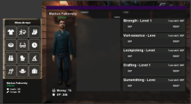
For citizens I would with my honest hearth suggest willard models for clothing or some similar offbrand as they are trully great to work with and look great.
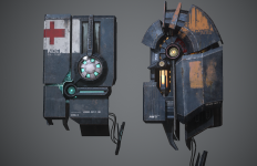
[Concept art of what I'm trying to suggest in no way representative of final product]
There are many high-quality models and original older models that are beloved by fans. I believe it is less about which specific models the server chooses and more about maintaining a consistent theme. Let me explain.
Let's say the server management decides to use Half-Life Alyx-inspired models, which are great on their own. However, a problem arises when other models in the game do not match the high-resolution, modern models, making them unnecessarily out of place. Therefore, I advocate for model and clothing cohesion on the server. Every model should be placed next to each other to ensure they all fit together seamlessly.
Additionally, using newer models raises the question of animations, particularly the outdated ones in GMod. Many new models do not look their best without updated walking and interaction animations, which can hurt immersion. While this is not an unfixable issue, it is important to consider it when deciding on the server's visual style.
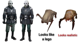
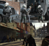
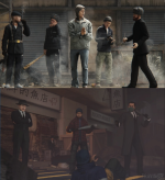
This principle also applies to props and entities. Using high-resolution models from Half-Life Alyx and AI-upscaled textures can create a visual disconnect if the rest of the server is styled in the traditional Half-Life 2 themes. Consistency is key to maintaining an immersive experience for players.
To ensure a cohesive visual identity, it is crucial that all props, entities, and textures align with the chosen aesthetic. Mixing ultra-modern, high-res models with older, lower-resolution ones can detract from the overall experience and feel out of place. Therefore server should carefully consider the visual harmony of every element to create a cohesive entity.
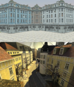
We have many visual styles to consider for the server. I would like to present a few to further illustrate my points.
Personal Note:
- I believe that sticking to this style would be the most benefitial for the server and I would wish to help with that by learning how to create "new" models in this style to improve on the servers content.
Conclusions:
This suggestion advocates for cohesion and outlines a guide on how to plan the server's visual identity effectively, I really hope that some of my ideas influence the decision making as I believe it would be benefitial to the server, also if you are reading this suggestion thanks for reading it all the way down it took some time to write this down.
Thanks, Markus.
1, Visual Identity of the server
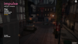
There are many aspects to consider for the server's visual identity. The most prominent is the current "Impulse"-inspired visuals, particularly in the main menu, inventories, and related UI, which remain unchanged and are outdated for a modern server. Therefore, I suggest addressing each part individually and making improvements, from player inventory to the tab menu each aspect should be addressed at least a bit.This does not require a complete overhaul but rather general enhancements. Gradually phasing out the Impulse identity and developing servers own unique aesthetic will help differentiate server and stray from the impulse theme. The best and easiest way to start this process is by updating the interface.
I believe that character creation and general improvements for the start cinematic of the server are greatly needed, as first impressions for new or returning HL2 players are crucial. This also includes phasing out the word "Impulse" wich is sticked everywhere, perhaps replacing it with something like "Astronet: Half-Life 2 Roleplay," or whatever you decide. Additionally, a custom logo for the server with greater depth in lore or I would say direction to which we wish to take it would be beneficial, and I will return to this point later.
1a, Inventory and HUD
I believe that the inventory system and HUD are the most important for everyday users. Improving the visuals and perhaps laying the groundwork for a future inventory overhaul would be beneficial. Breathing new life into the design could be a nice first step for improving the server's image.As stated before, more in-depth systems could be implemented regarding clothing and wearable items, incorporating item slots similar to other games to better organize the inventory. From my experience, the more items a server has, the harder it gets to navigate the inventory. Therefore, I also suggest adding clothing and, beyond that, fully functioning clothing equipment. Protective helmets should provide small bonuses, packs and backpacks should increase inventory space, and so on.
- Personal note:
For citizens I would with my honest hearth suggest willard models for clothing or some similar offbrand as they are trully great to work with and look great.
[Concept art of what I'm trying to suggest in no way representative of final product]

2. Importance of Cohesion in Updates and Player Models
There are many high-quality models and original older models that are beloved by fans. I believe it is less about which specific models the server chooses and more about maintaining a consistent theme. Let me explain.
Let's say the server management decides to use Half-Life Alyx-inspired models, which are great on their own. However, a problem arises when other models in the game do not match the high-resolution, modern models, making them unnecessarily out of place. Therefore, I advocate for model and clothing cohesion on the server. Every model should be placed next to each other to ensure they all fit together seamlessly.
Additionally, using newer models raises the question of animations, particularly the outdated ones in GMod. Many new models do not look their best without updated walking and interaction animations, which can hurt immersion. While this is not an unfixable issue, it is important to consider it when deciding on the server's visual style.


This principle also applies to props and entities. Using high-resolution models from Half-Life Alyx and AI-upscaled textures can create a visual disconnect if the rest of the server is styled in the traditional Half-Life 2 themes. Consistency is key to maintaining an immersive experience for players.
To ensure a cohesive visual identity, it is crucial that all props, entities, and textures align with the chosen aesthetic. Mixing ultra-modern, high-res models with older, lower-resolution ones can detract from the overall experience and feel out of place. Therefore server should carefully consider the visual harmony of every element to create a cohesive entity.


3. Visual Styles and Their Implications
We have many visual styles to consider for the server. I would like to present a few to further illustrate my points.
A. Half-Life 2 Theme [Old]
- This is the lesser-used style, utilizing old CP models with citizen models from the original game. From what I have seen, mostly only DarkRP servers stick to the original models, which are rarely used otherwise. The old, blocky CP models don't necessarily fit the GMod aesthetics well, which is why many servers opt for the second option.B. Half-Life 2 Theme [Updated]
- This is the most commonly used style. Many models updated over the last decade fit the GMod aesthetics perfectly. With a mix of newer and older models, there isn't a significant visual gap between them, creating a perfect visual harmony with the newer work and the GMod style.Personal Note:
- I believe that sticking to this style would be the most benefitial for the server and I would wish to help with that by learning how to create "new" models in this style to improve on the servers content.
C. Half-Life Alyx Theme
- The newest installment of Half-Life has swept the GMod community with incredible new content. Many people are eager to experience it. However, as stated above, it brings many challenges. These challenges, while arguably minor, break cohesion with other visual aspects of the game. Much of the GMod textures are a decade older than those in Half-Life Alyx. Therefore, a complete visual update of GMod and significant additional work is needed for this to work seamlessly. While it is worth it if incredible resources and time are invested to ensure the server meets the standard, it also limits the number of usable maps since there are few maps that match Alyx's quality.D. Half-Life 1 / Half-Life 2 Beta Theme
- This theme explores the most uncharted waters in the Half-Life world. It opens doors to many hidden and unseen content, which can be incredibly interesting. Ironically, the new Half-Life Alyx game shares similar problems, as it is a decade newer than Half-Life 2. Thus, many of the current GMod models stand out and don't mix well with the visuals. However, this can be addressed with sufficient resources.5. Custom Mixed Theme
- This approach involves creating a custom mix of various styles to craft a unique and distinct visual identity for the server. By selectively combining elements from Half-Life 2, Half-Life Alyx, and other sources, try and balance the things sure, but from all of my yapping here I'm trying to suggest that sticking to a single art style and working to improve on it and expand instead of forcibly trying to combine them, I'm also fan of reworking the new or old models into the current style of the server, HL:A models being reworked for HL2 and so on.Conclusions:
This suggestion advocates for cohesion and outlines a guide on how to plan the server's visual identity effectively, I really hope that some of my ideas influence the decision making as I believe it would be benefitial to the server, also if you are reading this suggestion thanks for reading it all the way down it took some time to write this down.
Thanks, Markus.


